Beyond Design.
Clearer Thinking.

We help you structure, design and deliver highly effective reports, presentations and visual resources.

25+ years’ experience · Work directly with our senior team · UK and international clients

Who we are

Mindfizz is a presentation design studio with over 25 years' experience helping organisations communicate with clear presentations, reports and visual resources.

We are different from other agencies as we focus on collaborating with clients from the start of the development process to help them clarify what needs to be communicated.

We then shape the material into effective resources that communicate clearly.

25+
Years in communication design
12+
Sectors including education and training, philanthropy, advocacy, legal, health, finance / fintech, energy and utilities, creative industries, sport and leisure and retail and across government, charities, and the private sector.
50+
Clients including NHS, AON, Department for Education, John Lewis, Energy & Utility Skills and Nationwide working in the UK and internationally
Our team

You work directly with the people responding to the brief, developing the thinking and delivering the final output.

Clare Dowland MSc.

Client liaison and concept development

Clare leads client liaison and concept development. She is the main point of contact for our clients, helping shape the brief, develop the direction and keep projects aligned with client needs.

View Clare on LinkedIn

James Dowland MSc.

Creative and technical lead

James leads the creative and technical development of the work. He is responsible for the graphics, visual systems and visual elements across our presentations, reports and digital resources.

View James on LinkedIn
Experience

Our experience covers a variety of areas. This gives us a unique understanding of your needs and how best to work with you to communicate to your audience.

Information and communication design

Clear layouts, information hierarchy, diagrams and presentations.

Communication

Structuring material so the right message reaches the audience, whether it's stakeholder engagement or communicating to senior leadership.

Business development

Supporting pitches, proposals and meetings.

Producing reports

Turning complex information into clear reports, summaries and briefings.

Visualising data

Presenting data analysis and statistical interpretation to show evidence, patterns and quantitative information.

Project management

Managing inputs, deadlines, review stages, quality assurance and final delivery.

We function as a critical friend to ensure your expertise and knowledge are presented effectively, allowing your clients, stakeholders, and wider audience to fully understand and act on your communications.

Purpose and audience

Defining what the communication needs to do, who it is for and what form it should take.

Structure and flow

Organising the content and planning the sequence of your presentation, report or resource.

Message and hierarchy

Identifying what matters most and creating a clear order of information.

Visual explanation

Creating diagrams, charts, maps, timelines, logic models and bespoke graphics that make information easier to understand.

See examples of how we structure information, design visuals and create decision-ready materials.

Download our overview (pdf)

We advise on the format and output based on the data and information you need to explain.

Presentations and briefings

Board and leadership presentations. Policy, research, funder and partner briefings.
Training presentations and materials.

Visual reports and summaries

Impact reports. Evaluation reports. Visual summaries and explainers.

Visual tools and frameworks

Bespoke charts, diagrams and timelines: designed to show relationships, sequences and patterns that text alone cannot demonstrate.

Digital resources

Interactive resources. Animated explainers. Digital documents.

Examples of how we have helped

A selection of projects where we were brought in early to shape the structure and narrative. Note – the majority of our work is commercially sensitive.

Our approach

Rather than showing finished client work, we have developed these examples ourselves, built around real problems, using the tools and approaches we bring to projects. They show how we think, not what we have delivered. We find that is a more useful starting point for a conversation than a polished case study with the sensitive information removed.

Threshold
This example shows how we approach advocacy communication, where the job is not just to inform but to build a case.
Systems mapping Causal loops Timeline design Decision mapping
A bold advocacy presentation title slide for Threshold titled 'THE HOUSING FAILURE: Why Britain builds the wrong homes, in the wrong places, for the wrong people' over a muted orange aerial neighborhood background.
A clean, professional advocacy presentation slide titled 'The problem we need to solve' featuring a two-column narrative layout that highlights key structural issues in the planning system with a bold orange takeaway statement: 'The incentive is to wait, not to build.
A professional quote presentation slide for Threshold featuring an orange-tinted headshot of Dame Kate Barker alongside a clean layout displaying a prominent policy quote on housing supply failure.
A high-impact dark teal presentation slide featuring a dramatic geometric triangle infographic that visually scales the massive policy deficit between social housing built in 1980 versus 2024.
A high-impact dark teal presentation slide titled 'The three things that would change everything' featuring a clean three-column layout outlining key strategic policy recommendations and actionable solutions.
A clean white presentation slide titled 'Who is affected and where' displaying a regional demographic data table for London, Midlands, and the North of England next to an abstract, geometric triangle map graphic of Great Britain.
A clean white presentation chart layout titled 'Permissions granted vs homes completed' featuring a dual-layered area graph with a custom housing silhouette overlay that visualizes a longitudinal data gap alongside a structured explanation column.
A detailed presentation layout titled 'An alternative development model' featuring an intricate circular process infographic mapping activity, ownership, and value retention for locally led development.
A professional corporate presentation closing slide for Threshold featuring a centered brand logo superimposed over a muted orange aerial view of a residential neighborhood.
LINEA
This example shows how different tools can be layered to build a progressively deeper picture of the same situation. The slides move from an annotated performance timeline, accessible to any audience, through a decision and action diagram, to a causal loop map that shows how the parts of the system interacted. Each tool answers a different question about the same problem.
Process modelling Policy communication Value-flow diagrams Strategic narratives
A minimalistic blue presentation slide titled 'Reading performance over time' featuring a subtle abstract white bar chart visualization mapping customer satisfaction metrics (CSAT) dips and stabilization trends over a timeline.
A blue presentation slide titled 'Understanding the scenario' displaying a structured, four-phase diagnostic timeline matrix mapping a corporate crisis from initial performance drop and shock to pivot and final result.
A clean white corporate presentation slide titled 'Tracking CSAT over time' featuring a behaviour over time chart annotated with key event milestones, quarters, and a contractual baseline metric.
A multi-panel presentation slide dashboard titled 'Outcomes and context' featuring three vertically stacked data visualizations mapping customer satisfaction trends, operational pressures, and unresolved ticket accumulations over time
A detailed presentation layout titled 'How CRM training took time to affect performance' showcasing a change management framework that maps the delay between leadership decisions, action lines, and performance indicators.
A structured white presentation slide titled 'Systemic alignment: evidence of the recovery cycle' displaying a detailed evaluation data table integrated with inline sparkline trend graphs split into early, mid, and late phases.
A high-impact white presentation slide titled 'Why CSAT fell and how it recovered' showcasing a clean, professional Causal Loop Diagram (CLD) with interconnected balancing and reinforcing feedback loops mapping organisational behavior.
Digital Access Advisory Group
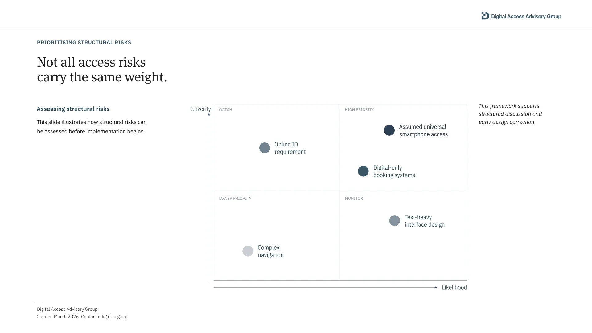
This example shows how we approach communication for technical advisory work, where the audience needs to understand a problem well enough to act on it, not just be informed about it. The slides below use three different tools to make access risks visible, prioritise them, and show where in a programme they can be addressed.
Risk mapping Decision tools Framework design Impact communication
A premium corporate presentation title slide for Digital Access Advisory Group titled 'Designing for equitable digital access' featuring an elegant serif typeface over a deep burgundy background with thin-line geometric architectural vector patterns.
A clean white corporate presentation slide titled 'Access is determined at the design stage — not at delivery' showcasing an elegant, asymmetrical layout with horizontally ruled numbered lists and a prominent sidebar takeaway statement.
A professional minimalist presentation slide titled 'Small design assumptions can create large access gaps' featuring a clean three-column layout with a structural risk definition, a numbered horizontal list of examples, and a large callout text block.
Risk matrix: Not all access risks carry the same weight
A professional minimalist consulting slide titled 'Where we contribute across the programme lifecycle' featuring a clean linear process timeline mapping 5 stages: Problem Framing, Programme Design, Implementation, Review, and Adjustment.
A clean, professional business presentation slide titled 'Structural risks can be addressed before implementation' featuring a minimalist three-column layout with numbered headings 01, 02, and 03 to outline consulting solutions.
A professional minimalist business slide titled 'Small structural shifts can prevent large access gaps' showcasing a two-column before and after comparison framework with horizontally ruled itemized lists.
A professional minimalist presentation slide layout titled 'Our work spans multiple national contexts' featuring a clean light gray world map vector with custom plotted data points and a clear sidebar text layout.

Have a complex story to communicate?

Tell us what you are working on, who needs to understand it and where you are in the process. We can start with notes, drafts, data, interviews or existing documents.

Tell us about your project

No obligation. Just a practical conversation about your project. We’ll only use these details to reply and won’t add you to a mailing list. Read our privacy notice.

Selected past clients and organisations we have worked with

  • AlphaPlus
  • AON
  • Brittany Ferries
  • Cardinal Health
  • Dentons
  • Department for Education
  • Drink Aware
  • Energy & Utility Skills
  • FAIST
  • HCL Tech
  • John Lewis
  • Kloud
  • MND Association
  • Nationwide
  • NHS
  • Plan International
  • Summix
  • Selex
  • Tribal
  • University of Edinburgh